Introduction #
The Advanced Login Page Customizer allows you to customize all aspects of your login form, including text fields, buttons, checkboxes, dropdowns, and the password visibility toggle. You can change the colors, borders, and styles to match your brand’s aesthetic, resulting in a consistent and professional login experience.
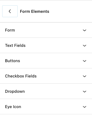
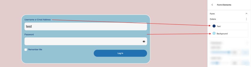
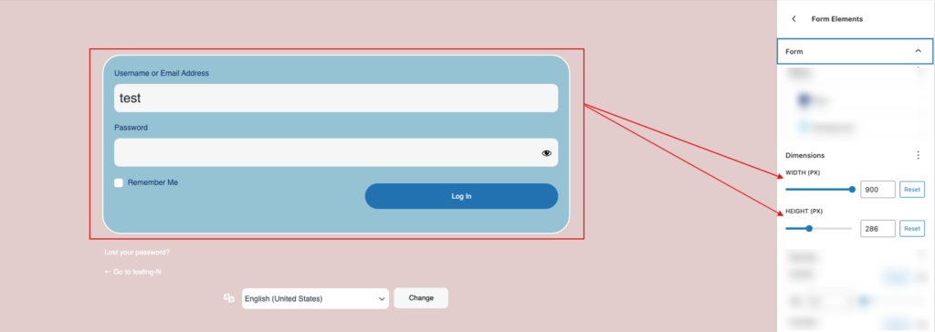
Form #
The form section has options for customizing colors, dimensions, spacing, and borders. These settings allow you to customize the appearance of each form element, ensuring that they match your overall design choices.
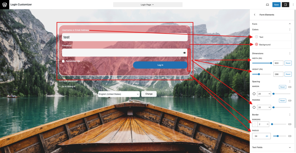
Colors
Here, you can change the text and background colors for the form, overriding any parent colors that have already been applied. This provides more versatility in obtaining the ideal style and ensuring that your form stands out on the login page.
Dimensions
In the dimensions section, you can change the width and height of the form. This allows you to adjust the form’s size so that it fits smoothly into your overall design. Setting the appropriate size improves the layout and user experience, making the login process more pleasant and visually appealing.
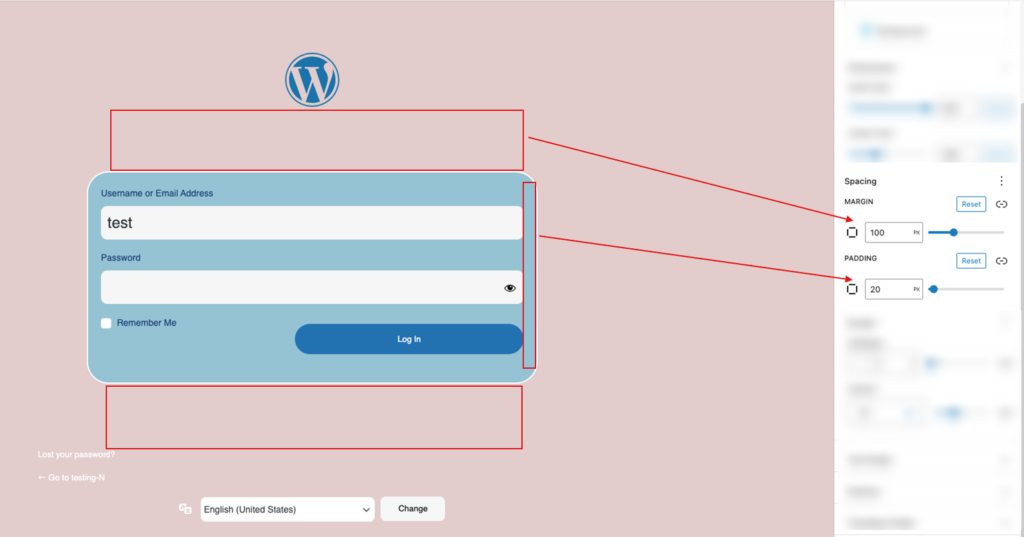
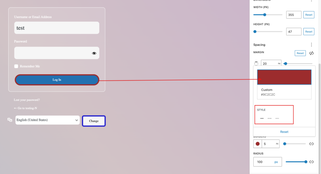
Spacing
In the spacing area, you can change the margin and padding for the form. The margin adds space around the form, while padding adjusts the spacing within it, allowing for more precise placement of text fields, buttons, and other components. These changes improve the overall layout and legibility, creating a more visually pleasing login experience.
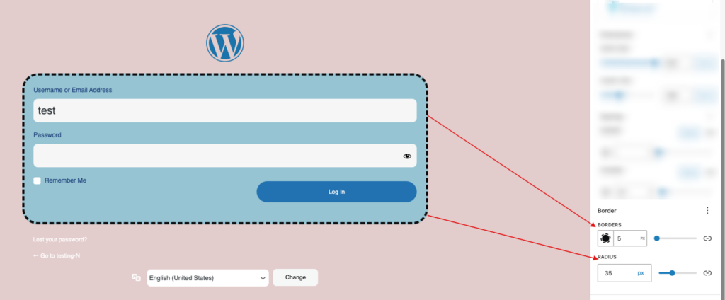
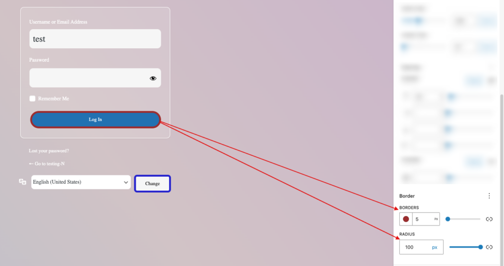
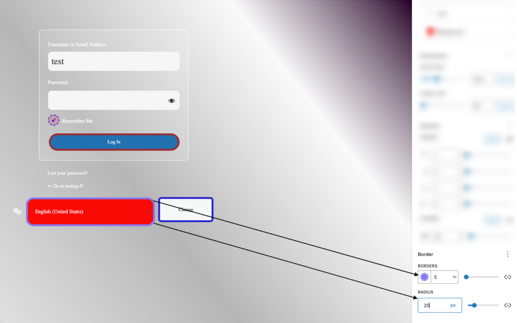
Borders
This section allows you to change the form’s border and border radius. You can change the border color, style, and width to create a unique edge that improves visibility and appeal. The border-radius option allows you to curve the corners for a softer, more modern appearance. These changes contribute to a polished and professional appearance, ensuring the form shines out while remaining consistent with your overall design.

Text Field #
You can customize the text fields within the form. Adjust the color, font, and background of the text fields to match your design, and set borders and padding for optimal spacing and readability. These options allow you to create a cohesive and user-friendly login form that aligns with your overall site aesthetic.
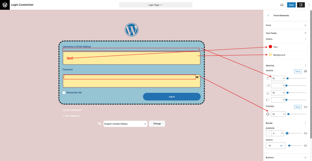
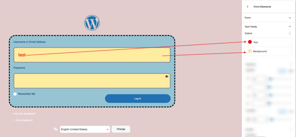
Colors
Here, you can modify the text and background colors of the text field, overriding any previously applied parent colors. This gives you greater flexibility in achieving the perfect look and ensuring that your form shines out on the login page.
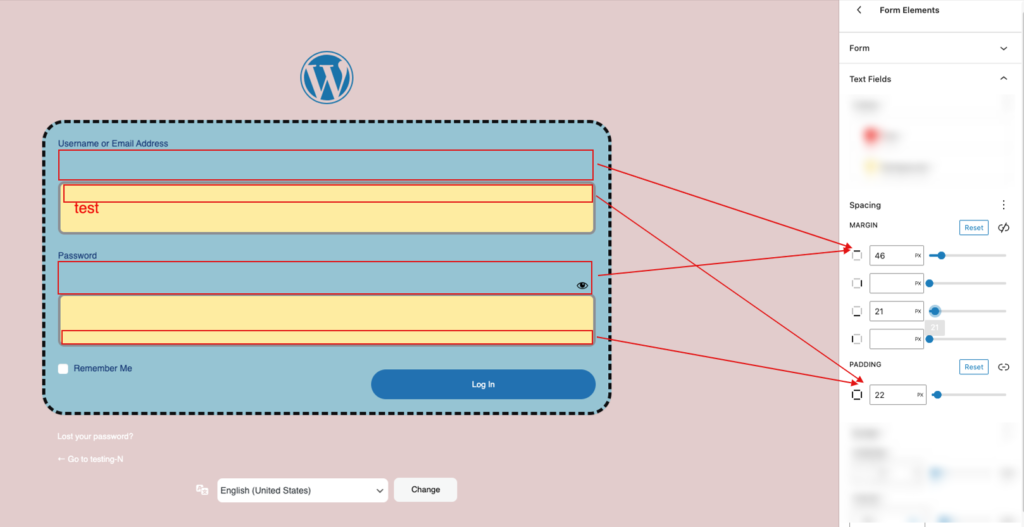
Spacing
You can adjust the text field’s margin and padding in the spacing section. The margin creates space around the form, whereas padding alters the spacing within it, allowing for more accurate placement of text fields, buttons, and other components. These adjustments improve overall layout and legibility, resulting in a more visually appealing login experience.
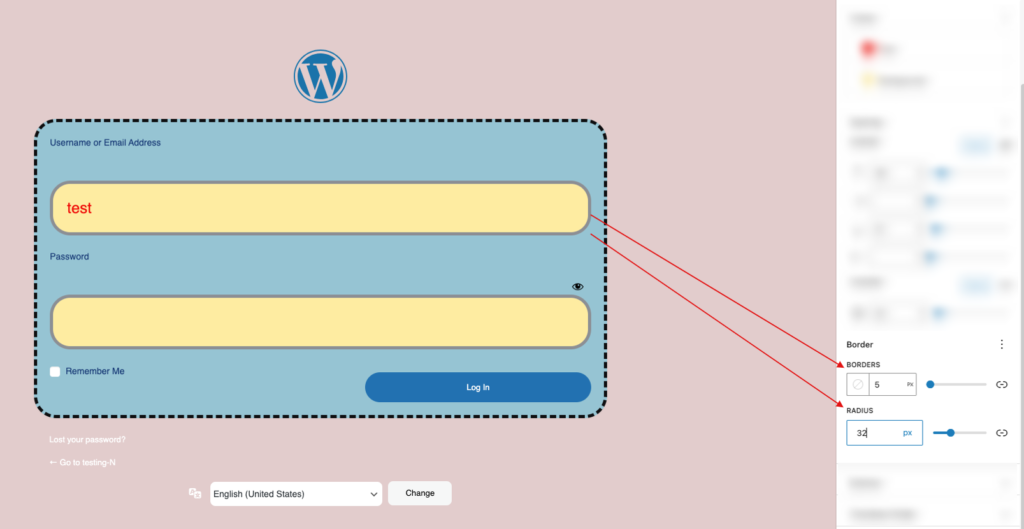
Borders
You can modify the form’s border and border radius in this area. To create a distinctive edge that increases visibility and attractiveness, you can alter the border’s color, style, and width. Curving the corners for a softer, more contemporary look is possible with the border-radius option. These adjustments guarantee that the form stands out while being true to your overall design, giving it a clean and businesslike appearance.
Button #
The login button can be styled in this section. The button’s background, size, font, and color may all be changed to match your design. To improve the button’s look and functionality and make it more visually appealing and consistent with the rest of your login form, you can also change the border, padding, and hover effects.
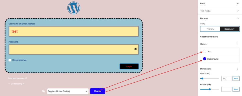
Colors
You can override any default settings in this section by choosing to individually alter the button’s text and background colors. This adaptability enables you to customize the button’s look to precisely match your layout and guarantee that it attracts attention on your login page.

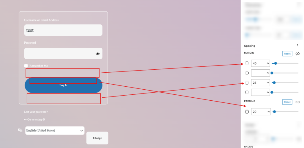
Spacing
The spacing section can be used to adjust the button’s position. While padding changes the spacing inside the button, margin adjustments govern the space surrounding the button. By enabling exact positioning, these parameters improve readability and layout, which in turn results in a more aesthetically pleasing login experience.
Borders
In this section, you can change the button border and radius. Change the color, style, and width of the border to create a more noticeable attractive border. For a modern design, add curved edges using the border-radius option. These settings make the form stand out while still maintaining a professional appearance that complements your design.
Checkbox Field #
You can personalize the checkbox field. Adjust the color, size, and style to ensure that it complements the overall design. These options create a more coherent design and improve the user experience by making the checkbox field visually appealing and simple to interact with.
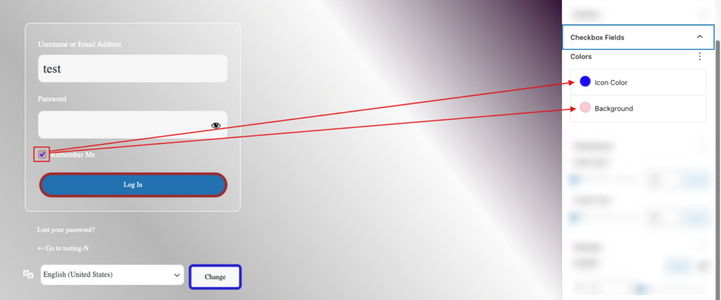
Colors
You can change the checkbox field colors to match your design. Adjusting the background, border, and checkmark colors allows you to make the checkbox visually appealing and consistent with the overall style of your form.
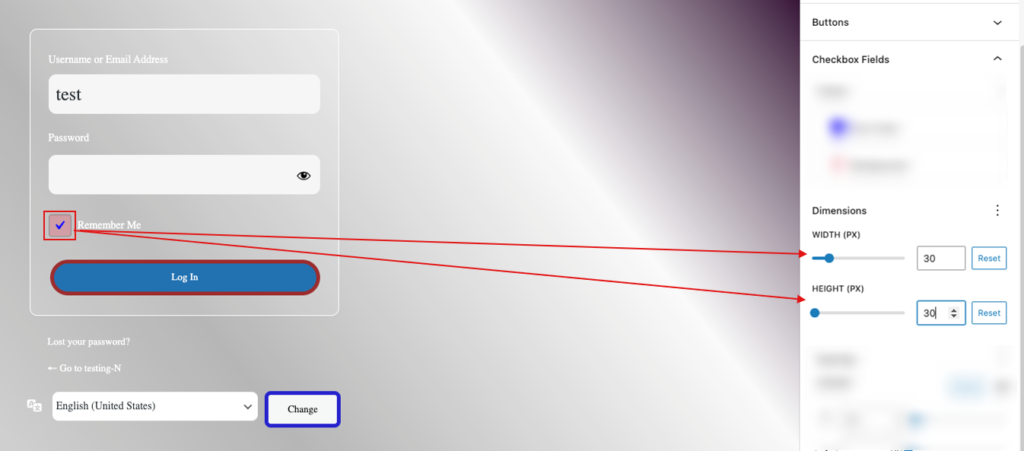
Dimensions
You can change the dimensions of the checkbox field to better suit your design. This includes adjusting the width and height to ensure it’s the right size for user interaction. Proper dimensions make the checkbox more accessible and visually appealing, which improves the entire user experience.
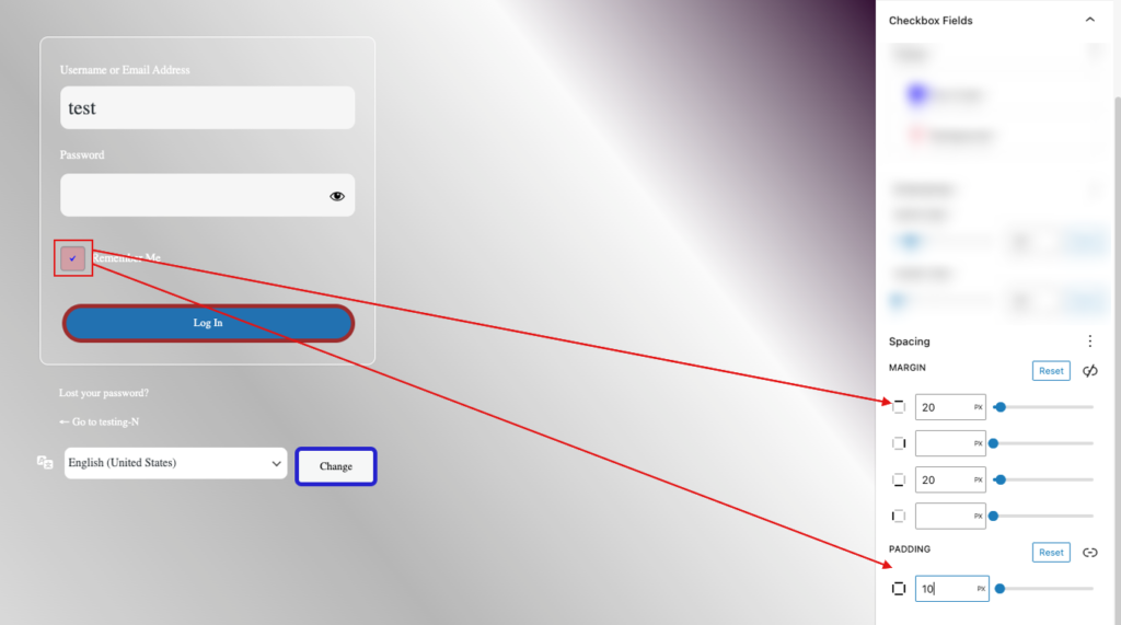
Spacing
Adjust the spacing around the checkbox field to improve layout and alignment. By adjusting the margin and padding, you may improve the visual balance and guarantee that the checkbox fits in with the rest of your form. Proper spacing improves readability and the overall user experience.
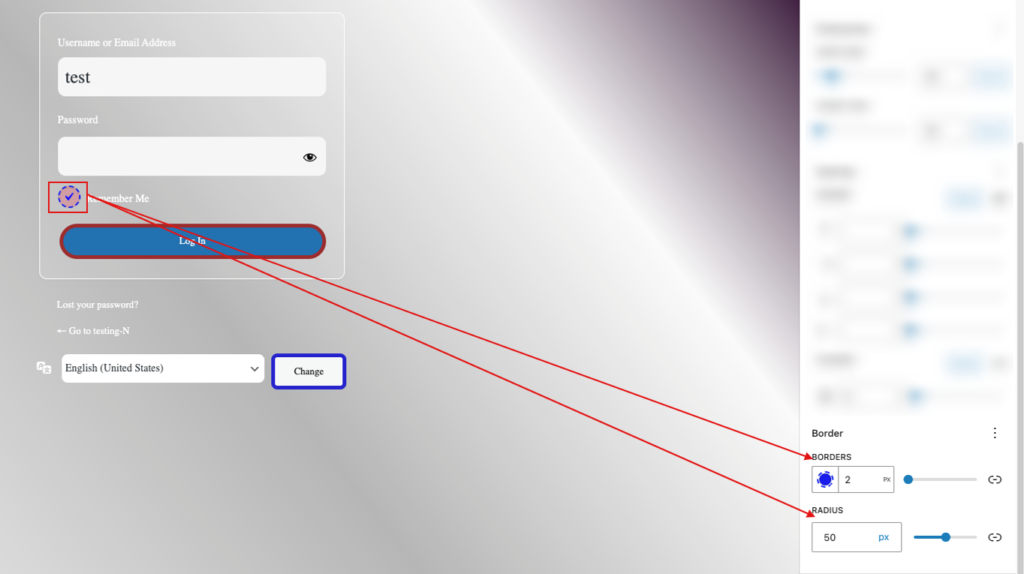
Borders
In this section, you can change the button border and radius. Change the color, style, and width of the border to create a more noticeable attractive border. For a modern design, add curved edges using the border-radius option. These settings make the form stand out while still maintaining a professional appearance that complements your design.
Dropdown #
Adjust the size, colors, and spacing of the dropdown field to change its appearance and functionality. Change the background and text colors to improve visibility and complement your design. Ensuring that the dropdown fits well into the layout improves the user experience. Well-designed dropdowns boost usability and help to maintain a consistent look throughout your form.
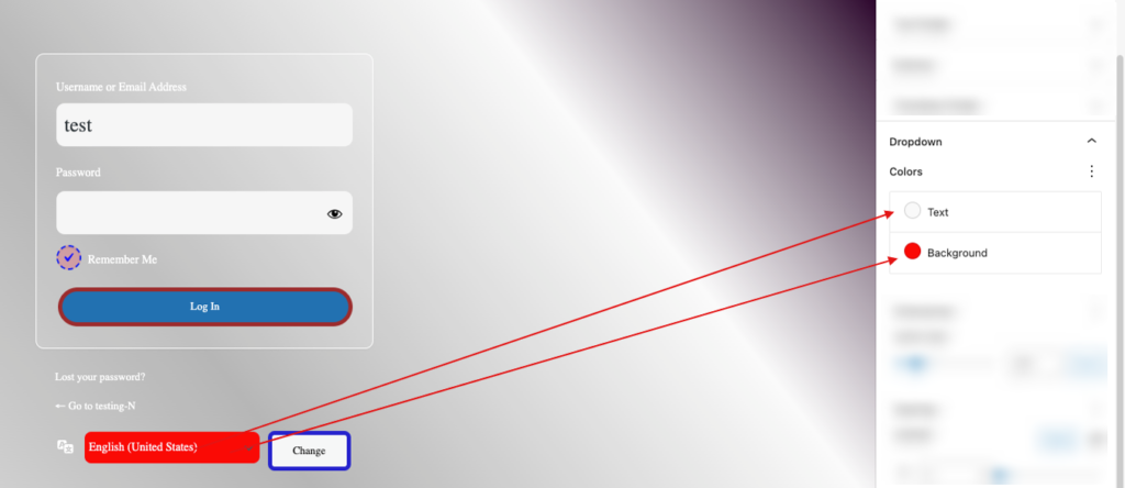
Colors
You can change the color of the dropdown field to improve visibility and match your overall style. To achieve a consistent look, change the background, text, and border colors. Choosing the proper colors makes the dropdown more appealing and distinguishable, which improves user engagement and overall aesthetics.
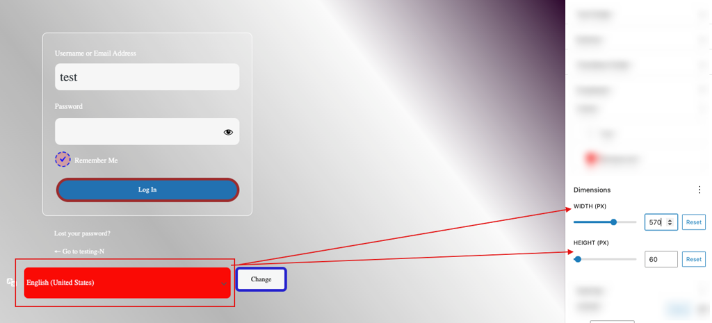
Dimensions
You can change the dimensions of the dropdown field to ensure it fits properly in your layout. Adjust the width and height to achieve a more balanced appearance and improved usage. Dropdowns that are properly sized are easier to interact with, which contributes to a better overall user experience.
Spacing
You can change the spacing around the dropdown field to improve the layout and the user experience. You may improve the visual balance of your form by adjusting the margin and padding. Proper spacing increases readability and makes the form more user-friendly.

Borders
You can change the border of the dropdown field to make it more visually appealing. Change the border’s color, style, and width to make it stand out and complement your design. You can also use border radius settings to create rounded corners for a softer appearance. These border modifications help to create a more polished and coherent form design.
Eye Icon #
You can change the eye icon in the password field to improve its appearance and functionality. Make the color, size, and position more accessible and consistent with your design. This icon allows users to change the password visibility, which improves usability and makes the form more user-friendly.
Colors
You can change the color of the eye icon to match your form’s style and increase visibility. Customize the icon’s color to match the background and other form elements. Proper color selection makes the icon stand out, improving the user experience by making it simple to identify and interact with.

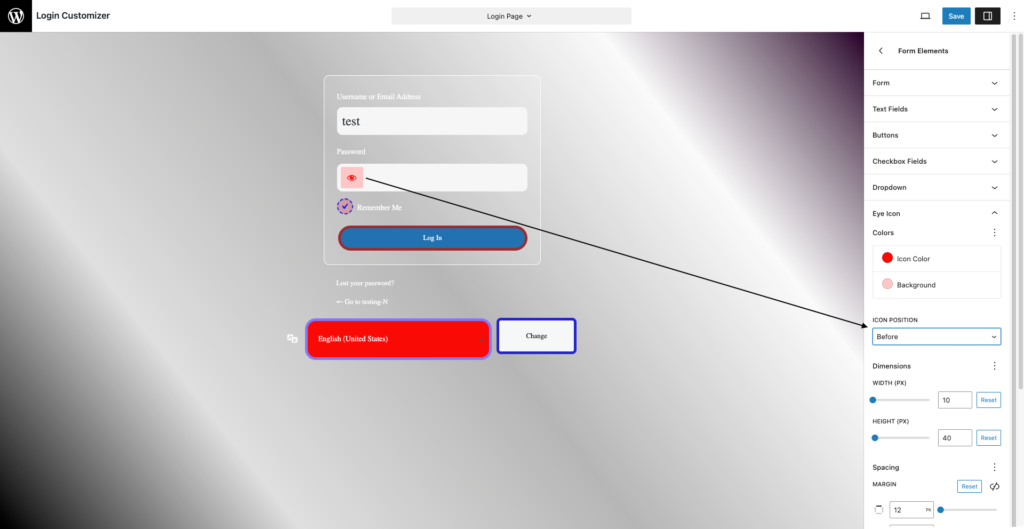
Icon Position
You can place the eye icon to show before or after the password field. Choosing the proper place improves usability by making the icon more accessible while maintaining a balanced form layout. This easy tweak can help to improve the user experience.

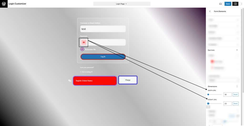
Dimensions
You can change the dimensions of the eye icon to ensure that it fits properly within the password box. By changing the size of the icon, you may increase its visibility and make it easier for people to engage with. Properly sized icons help to create a more professional and user-friendly form design.
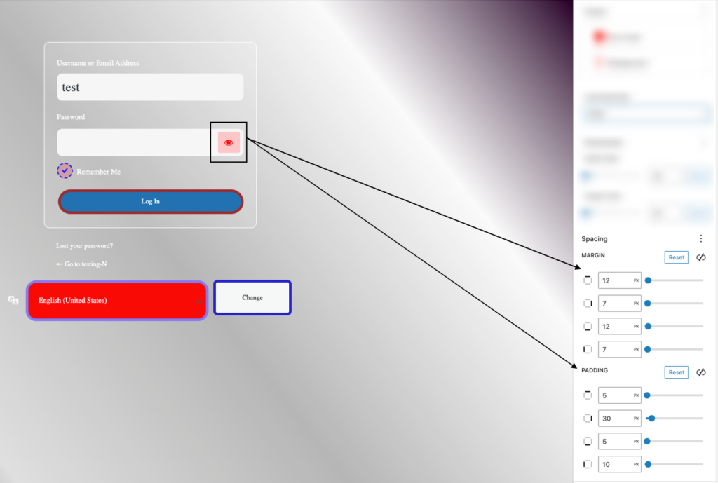
Spacing
You can adjust the spacing surrounding the eye icon to improve alignment and accessibility. Adjusting the margins and padding ensures that the icon is properly positioned within the password field, resulting in a balanced design. Proper spacing improves usability since it makes the icon easier to find and interact with.
If you have any questions or need assistance, please do not hesitate to contact our support team. We are here to help!


